























Purple and Lilac Nursery Ideas That Are Not Lavender Everything
Use purple on about a third of what you can see in the room, and no more. One painted wall, or the art, or the textiles — not all three at once. Lilac sits best against warm white and natural wood; a deeper violet needs something green nearby or the room turns cold by mid-afternoon. Everything below is how I get to that ratio.
Most of the purple nursery requests that reach my studio ask for lavender walls, a lavender rug, lavender bedding and lavender art. The finished room ends up reading as one continuous surface. The colour has nothing to push against, so nothing in it looks chosen. Here is the version that holds up.
How much purple should actually go in a nursery?
About a third. In practice that means picking one of three jobs for the colour and leaving the other two neutral.
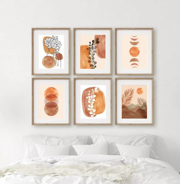
The first is a single painted wall — usually the one behind the cot — with everything else in warm white. The second is the art: white walls, and a set of prints above the change table or beside the cot doing all the colour work. The third is the textiles, where the curtains, rug and cot sheet carry the purple while the walls and art stay quiet.
The test I use when a parent sends me a photo of a half-finished room is this: purple should be the second thing your eye finds, after the cot. If it is the first thing, there is too much of it. If you cannot find it at all, the room has gone beige and needs one more purple object — not four.
Art is the easiest of the three to change your mind about, which is usually why I suggest it. A painted wall is a weekend and a tin of primer. A set of prints is ten minutes and a different set of hooks.
What colours go with lilac in a nursery?
Warm white, natural oak, soft green, and a dusty pink — in that order of safety.
Lilac is a cool colour with a lot of blue in it, and cool colours next to cool greys read as clinical very quickly. Warm white on the walls and an oak or beech cot are what stop that happening: the wood puts some orange back into the room without you having to decorate with orange.
Green is the pairing I reach for most. Sage and eucalyptus sit almost directly opposite purple on the colour wheel, but at a low enough saturation that neither one shouts. If there is already green in the room — a plant, a blanket, a print — the lilac will look considered rather than accidental. I went through the mechanics of this in what colour art goes with sage green walls, and it applies to a nursery just as well as to a living room.
Dusty and blush pinks work too, but they need a gap. Lilac against a strong pink competes; lilac against a chalky, greyed-off pink like the ones in my blush pink prints reads as one soft family. What I would avoid is lavender walls with lavender art, unless the art carries a lot of white.

How many prints go above a cot, and what size?
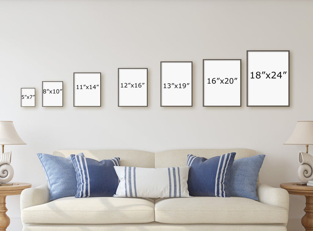
A set of three 11x14 inch (28 x 36 cm) portrait prints, hung with about 5 cm (2 inches) between them, spans roughly 94 cm (37 inches). A standard cot is about 132 cm (52 inches) long, so that arrangement covers a little under three-quarters of the cot width, which is the proportion that looks deliberate rather than stranded.
Scale down from there. Two 8x10 prints (20 x 25 cm) span about 46 cm (18 inches) and suit a narrower wall or the space beside a change table. A single 16x20 (40 x 50 cm) works if the wall is short and you would rather have one clear focal point than a row.
Where they hang matters more than the size. I would not put anything directly above where a baby’s head goes, however well fixed it is. Hang the set beside the cot, above the change table, or on the wall opposite, so it is something the baby looks at rather than something above them. If the cot wall is genuinely the only wall available, keep the bottom edge of the lowest frame well clear of the rail and use proper wall fixings rather than adhesive strips.
Most of what I make for nurseries comes as sets of three prints for that reason: three gives you a row wide enough to matter without any single sheet of paper being large enough to be a hazard.

Where does a personalised name print actually go?
In the middle of the set, not on its own.
A name print hung by itself on a large wall almost always looks smaller than it should. Put it in the centre position of a set of three, flanked by two florals, and it reads as the point of the arrangement rather than a label. That is how I lay out the lilac nursery name print set, where the child’s name sits between two watercolour florals in the same palette.
Two practical notes. Keep the name print portrait if the two beside it are portrait — a landscape centre panel in a portrait row is the single most common thing I end up talking people out of. And think about the length of the name before you choose a size: a five-letter name at 8x10 has room to breathe, while a ten-letter name at that size becomes very small lettering, and 11x14 is the better call.
The rest of the personalised name prints follow the same logic if lilac is not your palette. And if you are buying this as a gift rather than decorating your own nursery, personalised baby gifts that are not another blanket covers what to ask the parents before you order.

Will a purple nursery still work when she is seven?
The paint will not. The art might, which is the real argument for keeping the colour in the art.
Lilac walls are strongly associated with babies and toddlers, and they tend to get repainted somewhere around school age. A watercolour hydrangea or a wildflower print is just a picture of a flower — it moves to a bedroom, a hallway or a study without looking like a leftover. The name print is the one piece that genuinely dates, and even that usually outlives the paint, because the name does not change.
So if you want the room to age well, put the purple into things that can be swapped in an afternoon and keep the fixed surfaces — walls, floor, cot — neutral. That is not a compromise. It is the same advice I would give for any room where the occupant’s taste is going to change, which is every room.
Where to start
Decide which of the three jobs purple is doing before you buy anything. If the answer is the art, measure the wall you actually have — not the wall in the photo you saved — and work backwards to a set size using the numbers above. The rest of the nursery and kids room wall art is there once you know how much width you are filling.
À propos de DiviArts Studio
Chez DiviArts Studio, nous proposons un vaste assortiment de reproductions d'art mural à l'aquarelle, d'œuvres d'art numériques imprimables, de portraits d'animaux personnalisés, d'affiches, de cartes de vœux, de mugs, de cadeaux et de produits artistiques, le tout sur des thèmes variés. Nous vous aiderons à trouver l'objet parfait dont vous avez besoin. Égayez votre intérieur avec nos pièces d'art abordables qui lieront indéniablement l'ensemble de votre espace. Explorez dès maintenant notre gamme exclusive pour rehausser instantanément votre décoration intérieure, ou offrez-les simplement à vos proches comme témoignage d'amour et d'affection. Nous offrons une livraison mondiale sans tracas.
À propos de Divisha Mehta